Problem to solve: Help marketers self-correct their ad copy so that they run less risk of having their ads rejected
Time to completion: 3 months from research to implementation
Format: responsive web
My role: sole designer
Result: not shipped 😾
Assisted ads creation
The problem to solve
LinkedIn aimed to improve the ad creation experience in Campaign Manager by offering advertisers a way to self-correct their ad text.
The project team identified common reasons for ad rejection, mainly related to language and URLs, and hypothesized that these issues could be addressed with a text analysis tool.
The solution needed to be integrated into the ad creation UI, where users input text that could cause their ad to be approved or rejected. After several attempts to align on a user flow due to biases towards existing UI components, the team decided on an in-line text correction feature during the first design review.

Comparative Research
When I joined the project, product leadership had proposed adding in-line text correction to our campaign creation tool to address issues like spelling errors and policy violations. To understand the space, I researched similar features in Grammarly, Google, and Microsoft Office.

Screenshots from the use of text correction in Grammarly

Screenshots from the use of text correction in MS Word
System design
To create a human-friendly text correction experience, we developed a text management system and interaction model for quick changes.
We categorized corrections, prioritizing content-related issues that might require a full rewrite, making other corrections unnecessary. Early fixes, like addressing all-caps text, prevented repeated error highlights.

Card and panel
Next, I designed an interaction model to help users manage changes after they received guidance. I explored several options to ensure accessibility and usability, ultimately choosing a simple inline card for individual changes and a panel for bulk changes.

Card Open: While the user is creating an ad in Campaign Manager, they type into the input field. As they type, red highlights and a red "counter" label appear, offering direct guidance on correcting the text to avoid ad rejection.

Panel Open: While the user is creating an ad in Campaign Manager, red highlights and a red "counter" label appear as they type into the input field. Clicking the red "counter" opens a panel that displays suggested text corrections, organized by category.
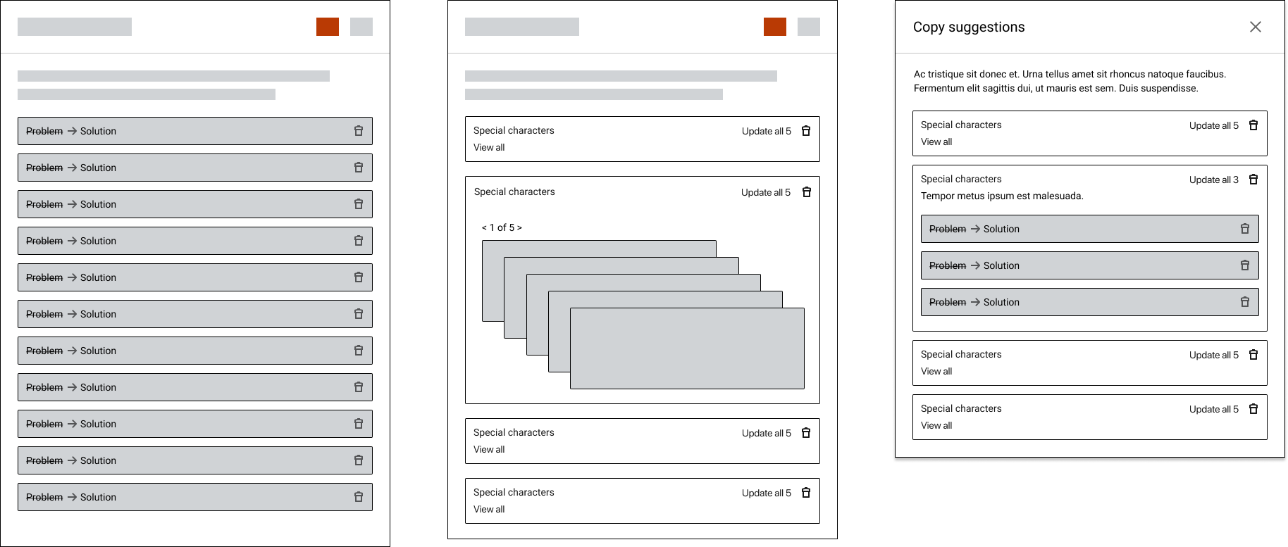
Panel Variations: I experimented with various panel designs, including some used by competitors, such as unordered lists and stacked cards. Ultimately, I chose a category-organized list, enabling users to make bulk corrections if they preferred.

Responsive Screens: Early in the design process, I tested the panel design across various screen sizes. This "all-up" technique ensured the design was functional even on the smallest supported screen size, which was 320 pixels wide.
Final interaction design
The cards
In the "cards" interface, users click on individual words and receive guidance on how to correct the text. The red "counter" tracks the number of needed corrections and updates as users make changes. This design allows users to choose the order of corrections, giving them full control over the process.

The panel
In the "panel" interface, users correct the text within a side panel that opens next to the input field. This UI is more structured, presenting suggested corrections in a specific order.
User research showed that business users preferred the "panel" for several reasons. As professional content managers, they used the panel to make screenshots and document problems before making corrections. They also appreciated its efficiency, as the text could be fully corrected with just four clicks.

Usability testing
In the final project stage, I partnered with a user researcher to conduct usability tests with a Figma prototype. We identified key assumptions and crafted a guiding narrative for the testing sessions., Then, using the RITE method, we made immediate design adjustments based on participant feedback.
The prototype was well-received, with participants easily grasping its purpose, leading us to simplify text explanations. Interest in providing feedback to the recommendation AI was minimal, as users felt it mainly benefited LinkedIn.
Final screens

First-Time User: as the user begins entering text into the ads editor, a tooltip appears, informing them that assistance is available.

As the user adds text, the assistant highlights any sections that fall outside content guidelines and suggests corrections.

Corrections are delivered by category rather than by word order, in order to reduce repetitive tasks for the user.

Alternatively, the user can tap the red number label to open a panel. This panel provides the same text guidance in an easy-to-review format, maintaining the same order.

As the user corrects text issues in the panel, the next section opens, presenting additional tasks to complete.
Learnings
When I was working on this project I had become accustomed to a world where almost everything I designed would get built out and ship. It was a blow to realize that this project would not get prioritized.
While I’m not exactly sure this design never saw the light of day, I suspect that it appeared too closed to the dawn of wide-spread use of LLMs, and for this reason was seen as duplicative of those technologies.