Developers
content pages
Problem to solve: provide new content and information architecture for developer portal site
Time to completion: 4 months from research to implementation
Format: responsive web
My role: initiator and sole designer
Result: internal fanfare and design longevity
The problem to solve
LinkedIn struggled to get revenue from its API website and had a high volume of support calls.
When I joined, the front page featured only three product cards, underselling the offering.
The navigation was cluttered with links to numerous external sites, each introducing new layouts and terms.
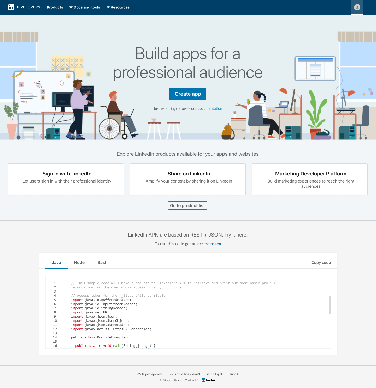
The existing homepage with just three product cards
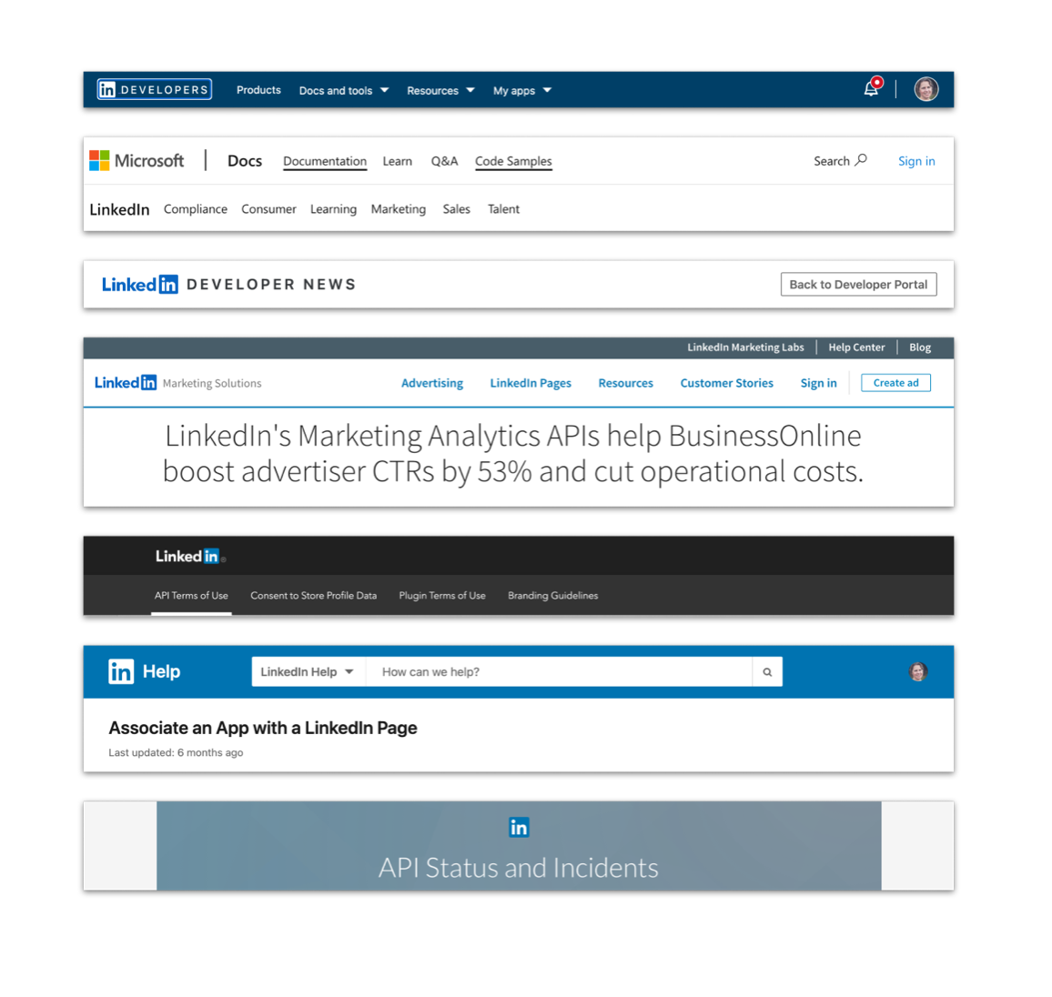
External websites with inconsistent navigation bars
💩 “The LinkedIn Developer Portal is poorly documented, no info on process and no info on process results.”
— API program developer
User research
To understand how companies adopted APIs, I started a foundational user research project with a specialist. The findings were surprising:
We discovered that product leaders, not engineers, were finding APIs while searching for solutions to specific problems.
Adoption was initiated by a product leader or an end-user, who would become an advocate, and later transform into a product owner.
Technical partners joined the process later, expecting both non-technical and technical materials on the website. The whole process was driven by users reading and sharing content.
Nina, a PM at a marketing startup, has an idea for a feature that requires a large dataset her company lacks. After Googling, she finds an API that might solve her problem and then approaches Raj, a lead engineer on her team...
Product principles
Our product principles originated in the user pain points that had been revealed in the research
Team members should easily find relevant information, with text about the API's value linked to the right technical docs, so both product and technical people can access what they need.
Team members should understand the API's end value and be able to convey it to others, perhaps by showcasing real company case studies to highlight the value without sounding like an ad.
Team members should have visibility into each other's tasks and progress, with lists of links to content for product, technical, and legal partners.
Information architecture
To serve our multiple user archetypes and their content needs, I put together a sitemap.
Most developer portals function like storefronts, either as boutiques or department stores.
organized our content by the lines of business (marketing, sales, learning, etc.) creating a friendly, familiar user flow.

Wireframes
Once I had an information architecture, I began creating wireframes based on patterns found in the company design system.
All our screens needed to be responsive to meet accessibility requirements, so I tried the designs on all breakpoints at an early stage.

Page layout
When I reached the page design phase, we encountered some hurdles. The designs exposed misalignment among some stakeholders, making it difficult to decide what offerings would actually be shown on the pages.
I also discovered designing content-heavy pages was a bit outside our usual workflow, highlighting the difference between our usual product design practice, and website design for content.
The product team aligned once a temporary PM was assigned, and a few iterations later we could finalize page layouts.

Final designs
Our final designs relied on a simple hierarchy based in clean typography and a grid of cards, each representing the products in a product line.
Product pages
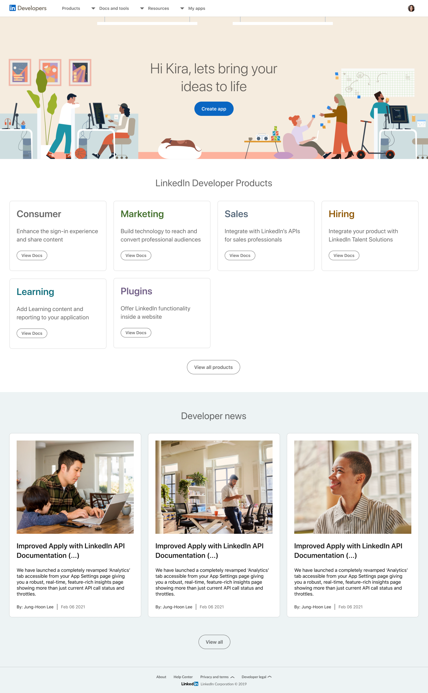
Home page

Product catalog

Product category page

Product detail page
Content pages

Case study detail page

Developer news category page

Developer news detail page
Learnings
The results of this project were met with internal acclaim and the project was featured in a "Product Top 5" email sent to 11,000 LinkedIn employees.
Leading a design-led project without a dedicated PM was a professional risk, exposing long-standing requirements misalignment that concerned some colleagues.
My commitment to the project stemmed from our user research, which we had initially failed to act upon. Seeing it through to completion seemed important.
While I couldn’t eliminate the reliance on external sites, I unified the content with a consistent taxonomy, setting the stage for future efforts with a good foundation.

Thoughts on this project from product leadership
“The design refresh is a night and day difference. With these enhancements & resources, we’ve empowered developers to understand how to work with LinkedIn and to build products that drive both customer and member value.
We will continue to onboard rich developer content for API products across all lines of business including product overview, access details, case studies, and more.”
— Tomer Cohen, Chief Product Officer @ LinkedIn