Tech health dashboard
This design allows users to create reports by selecting multiple filters that govern a powerful summary page, including data visualization and links to data deep-dives.
Time to completion: two months
Format: responsive web
My role: sole designer
Result: positive customer feedback
Problem to solve
Spotify had created the Soundcheck plugin in its Backstage developer portal to help developers enforce code standards.
Customers wanted a no-code interface for creating checks and a dashboard for analytics, features competitors already offered. To avoid losing customers, we set these product principles:
Simplify adoption: Offer a no-code UI for easy setup and management.
Achieve feature parity: Match competitors with a no-code UI and strong analytics.

Existing design of the plugin, before we begun work
User archetypes
Our project focused on two user archetypes: Tech Leadership and Component-Owning Teams. We created dashboards for leadership to monitor key metrics and provided teams with tools to track component health, export data, and set alerts.
-

Tech leadership
This user needs dashboards to monitor track adoption, performance, and check pass rates, with snapshot and trend views. They also need change notifications and export options for reports.
-

Component owners
These teams need visibility into their components' health, including overall pass/fail rates, metrics across tracks and levels, and check statuses. They'll need to export data and set up alerts.
System designs
I worked with two engineers to design the information architecture and user flows, focusing on the needs of tech leaders and component-owning teams. Using the storymapping workshop technique, we created user stories that guided the development of IA diagrams and flowmaps, which became the foundation for the screen design.
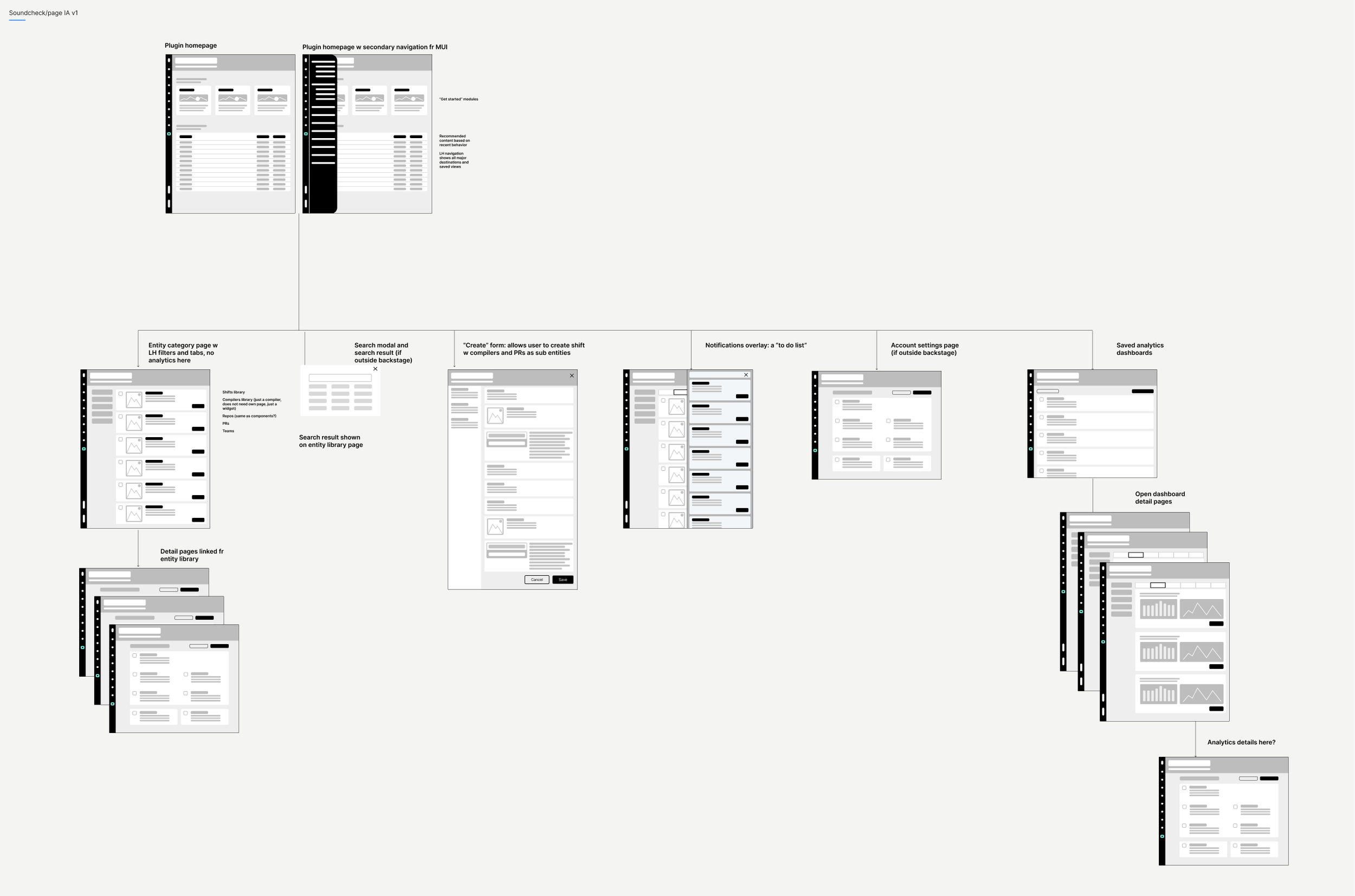
My information architecture diagram is shown with mini-wireframes to make it easy to understand

My flowmaps are used to translate the user stories into user journeys on screens

My mini-wireframes are created to make the flowmaps easier to understand for my PM and engg partners
Interaction model
For this dashboard, I used an interaction model I had seen in action while working at LinkedIn. It includes a data dashboard with left-hand navigation, global filtering, an overview page with data visualizations, and category pages listing entities and actions.
In my version, users can create new entities directly from these pages. I chose this model because it turns data insights into actionable tasks, boosting user productivity and decision-making.

The dashboard header provides context and delivers key information, such as user profile details

The sidebar contains global filters that govern the date displayed on all tabs

The Overview tab presents global insights through tables and data visualizations.

The peaks and valleys displayed on the data visualization cards capture user attention and drive them to explore the category tabs for deeper insights

The category tabs deliver more in-depth insights and include actionable prompts like edit, share and archive
Wireframes
Using this powerful interaction model, I could easily translate the user stories and flows into interaction design. I chose to create fairly high fidelity wireframes to clearly communicate my proposals to the engineers.
This approach also gave us a clickable prototype, which we could use to validate our ideas with customers who were eager to see what we planned to deliver in a future release.

The plugin homepage offers up starting points for common tasks and a list of recent views

That dashboard overview with shows data visualization and links to deep-dives of the data in the tabs

The overview page and tabs link out to category pages with list views of the data
— Customer who reviewed our designs at the wireframe stage
“100% this is what we need”
😻
Final designs
The design was ready to go, so I applied components from our design system to the wireframes, turning them into high-fidelity screens.
We tested the designs with 12 tech-savvy health app users using the RITE method, and made iterative improvements based on their feedback. The prototype performed well, confirming that we were on the right track and ready for implementation.

Plugin homepage with starting tasks and saved views
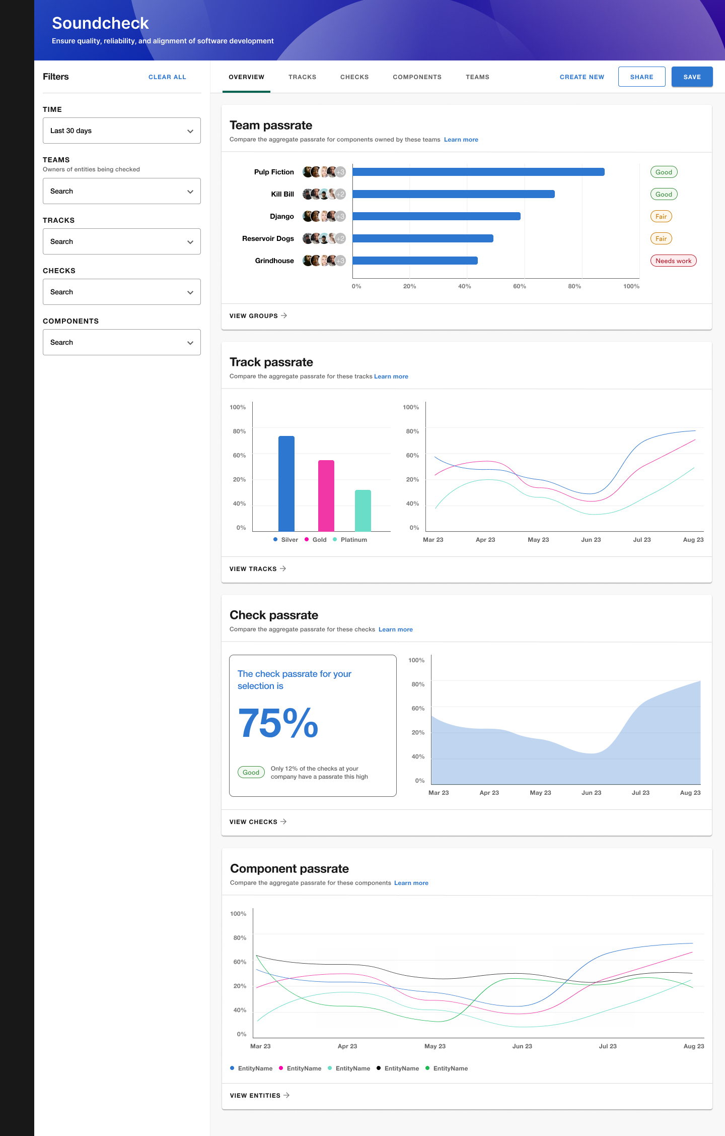
Tech health overview with data visualizations and links to deep-dives of categories of data insights

List view of data category, with views governed by filters in the left hand nav

The create track experience allows a user to organize checks into groups

The edit track experience allows a user to manage the grouped checks

The check creation experience featuring a complex boolean selector that was also used in other Spotify apps

The detail page presents the check information in a compact state and offers an edit state
— User research participant
“The design is clean and modern. This solution can replace the multiple dashboards we have today in Grafana and elsewhere”
Learnings
Looking back on this project I had two reflections:
The storymapping format proved highly effective for our technical product, requiring minimal meeting time while allowing subject matter experts to contribute and share knowledge efficiently.
The speedy approach we used for this project is unsustainable, and it hurt quality. For a follow-up sprint, I would want to focus on measurable customer satisfaction, rather than just what features were delivered.